
How to Travel Solo Book Design
- Design type: book design
- Format: eBook, printed paperback
- Client: Writer Gianluca Fiore
- Seen on: Amazon.com, GoodReads
- Elements designed: Custom icons, page layout, typography, illustrations, cover concept, photography editing
- Tools: Affinity Design, Affinity Publisher, Adobe Lightroom
Objective
The client wanted to self-publish his book on how to travel solo. It was requested a complete design package, including cover design, custom icons, illustrations, color palette, typography, pagination, and formatting. The book needed to be accessible in e-book and print format.
Challenges
Among many travel books, the design should have been able to easily stand out. The clients had a color palette in mind that matched his writing business, and that put constraints in how the global design would look like.
The book should be easily readable in electronic and paper formats with the same design. This needed a good study of typography, selecting the right illustrations and icons, and developing a front, spine, and back cover that would look appealing in various formats.
Process
I started by heavily discussing with the clients the desired idea to convey with the design. The book was aimed at solo travelers that had little to no experience of it. The message of the book was to encourage reluctant travelers to travel more on their own, and was full of tips and practical advice on how to travel solo from an experienced traveler point of view.
The main cover was the starting point of the design. I chose with the client among a range of photographs the one that would best convey the message of the book and one with the author’s walking alone in a foreign city, intently looking at the architecture, was the chosen image for the front cover. I decided to desaturate it to better contrast with the color palette proposed by the client, a light blue and a warm yellow.
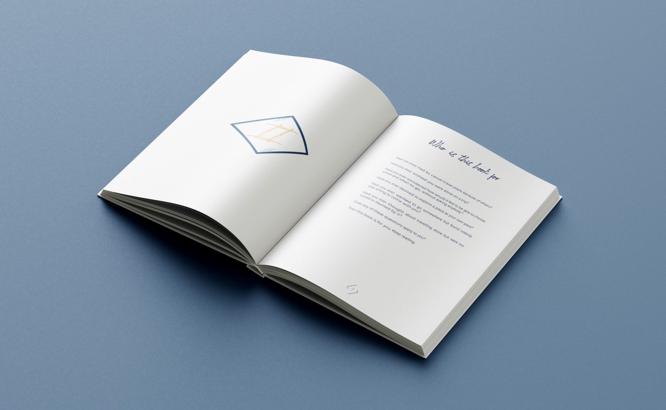
Geometrical shapes were designed with Adobe tools to mark the chapters and pagination. The numeration was manually added in a pencil-looking font, to connect with the idea of travel diaries hastily written while traveling. Typography was selected to be soft-looking, semi-cursive in the headings, and with a dark blue color that would link with the cover’s light blue.
Adobe InDesign, Affinity Designer, Affinity Publisher were the main tools for this project, along with one by one retouching of the furnished photographs in Adobe Lightroom.
Final Design
The final book design was 100+ pages, formatted to be easy to read and with custom icons and illustration to help the reader be engaged. The book was published via KDP self-publishing system on Amazon.com
 using WordPress and